Hello everyone!
Welcome to the second mental ray lighting tutorial. In this feature, I’ll be walking you through a typical lighting project for a scene I built for one of my Monday Movies. Remember that this isn’t the only way to illuminate a scene, and your render times could get pretty high. We’ll be using mental ray Sun&Sky to get the base lighting, followed by a few area lights to illuminate the hallway section of the render. I’ll show you some common settings you’ll need to set up along the way, and by the time we’re done you should have a well lit scene!
You can download the starter 3dsMax Scene Here.
Note that some of these images will have light leaks above the center divider wall. I didn’t notice these until I was done writing the tutorial, so please excuse the error. The scene I uploaded for you to start with has been fixed. In addition, at the end I changed the floor to carpet instead of hardwood, so don’t be surprised when you start rendering and notice there’s carpeting.
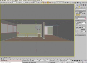
Go ahead and load up the file You’ll notice that there isn’t any lighting, but the materials work together pretty well. I’ve gone ahead and included some little details such as the coffee maker and the tree. However, you’re free to add anything you’d like! Throw in a conference table for good measure, or some blinds on the windows if you’d like to be extra classy.
If you take a quick render, you’ll notice that the lighting is unimpressive, but the materials are right and the modeling is diverse enough to give us a good outcome once we’ve started lighting.
The first thing we need to do is create a daylight system in 3dsMax. Day-time renders are a piece of cake because most of the lighting comes from outside. Under the “Systems” tab of the modify panel, you’ll see “Daylight”. Create a daylight system by clicking and dragging to create the compass rose, followed by another drag and a click to create the light. If you get a dialogue asking if you’d like to use photographic exposure control, click “Yes”. It will yield good results and is vital for this tutorial. The direction of the light doesn’t matter. Click on “Manual” under the “Position” group in the modify panel, and you can then drag the sunlight light wherever you want. I recommend a glancing angle that bounces the light off the floor and wall.
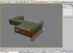
Ignore the box you see on the open face of the building. It’s a little hack that lets you see inside a wall while keeping it inpermiable to light. That box is renderable and only casts shadows. The rest of the walls have a shell modifier on them.
The next step is to set the daylight object to mr Sun and mr Sky. I know it seems like this should be on by default, but there are times when you’ll need to use IES. This isn’t one of them though. By setting the daylight to mental ray Sun and Sky, you’ll be tapping into a powerful natural lighting engine that can make just about anything look awesome. If you get a dialogue asking if you’d like to set the background to the mr Sky map, click “Yes”. It’s just a good idea if you’ve got nothing else for a background.
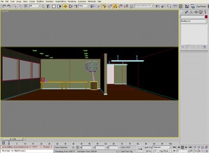
Go ahead and take a quick render. You’ll see that our scene’s lighting has changed dramatically, and Final Gather is now giving us a little more depth.
Comparable to a real-life photograph, the exposure is adjusted to make the outdoors look reasonable at the expense of making the indoors too dark. We’ll increase the exposure shortly. First, we’ll help mental ray understand that these windows boarder the outside world, and should therefore bring in a little more light.
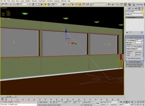
Under the “Create” tab, under the “Lights” section, you’ll find mr Sky Portal under the “Photometric” group. The mr Sky Portal can be put in the window frames to boost the lighting, and basically earn us an additional Final Gather bounce for free.
It’s important that they reasonably approximate the window frame. It’ll take some guessing and checking, but it’s worth it. You’ll also want to enable the “From ‘Outdoors'” checkbox, if available.
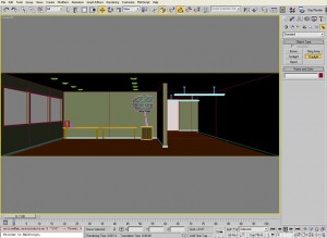
Now that the sky portals are set up, take another render. Notice the difference between this and what you had before. The additional light is clearest on the ceiling and the blueish glow on the wall.
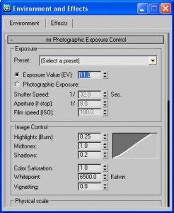
But the image is still too dark! Like I mentioned earlier, our exposure is set to make the outdoors look normal at the expense of how the indoors looks. Let’s increase our exposure such that the indoors looks normal and the outdoors looks blown out. Open your Environment and Effects window (hotkey ‘8’) and set the exposure value to 11. Don’t hesitate to try other values and see what you think. This is a very powerful mechanism for altering the brightness of your renders.
Here’s what my render looks like with a value of 11.
We’re looking good! But the hallway still doesn’t have any light. The client won’t like that one bit! Let’s add some lights to the lamps hanging from the ceiling. Select a “Free Light” from the photometric group in the lighting section of the create panel, and place it in the light trough of one of the lamps.
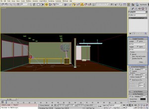
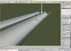
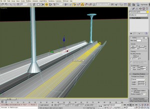
In this case, we want to use long cylindrical lights like fluorescent tubes. We’ll need to select “Cylinder” under the “Emit Light From (Shape)” group. We’ll also need to alter the length and radius of the light to fit nicely in the trough. Finally, be sure to enable “Light Shape Visible in Rendering” so that it actually appears as a tube! It’ll look great with the semi-transparent material I used. Finally, we need to set up the shadow casting. Select “Raytraced” from the pulldown under the “Shadows” group, and then click the exclude button. You want to exclude the light troughs because otherwise they’ll create abnormal shadows on the walls. From the list that appears, select Cylinder02, Cylinder 03, Cylinder09, and Cylinder10. Sorry for the lousy naming conventions- these are the troughs. Finally, select Exclude from shadow casting only; we still want the troughs to light up!
Here’s a render showing where we are so far. The hallway is starting to light up nicely, and the conference room looks like it might actually make meetings fun. This is really going to blow away that client, but we’ve still got a little ways to go before it’s perfect.
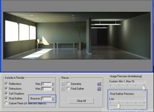
From here, let’s bump up the mental ray settings a little. The Final Gather bounces are still on zero and very low precision. The bounces value can be changed to 1 and the Final Gather Precision slider can be moved to “Low”. The renders will take longer, so don’t hesitate to lower these back down until the very end. I’m just increasing these to get closer to my final render.
Here’s what the render looks like after the increases. There’s a little more light in the corners as the Final Gather bounce pushes the lighting into recessed corners. It’s a subtle, but important difference.
We’re almost done! I just want to add two more things.
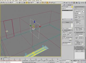
The first is a light around the corner in the hallway to show that it’s a corner and to imply that the building is larger than just what’s in the field of view. I accomplished this by using a “Free Light” (like in the lamps), only this time I’ll be using a rectangular area light. This will create better shadowing by the door, and make it look like there’s more natural light (like from the other side of the office building). Be sure to increase the brightness a little (I used 2000 cd).
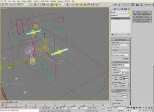
The last thing we want to do is boost up the lighting in the hallway. Right now we’re only seeing what the four florescent lights are generating with the help of the Final Gather bounces. Unfortunately, it’s a little rough between the two lamp units so we’ll want to throw in an ambient-only, standard omni light to brighten it up a bit. Notice that you’ll need to use an abnormally high intensity in order to compete in the photographic exposure control solution. If you didn’t have the exposure control on, the image would be pretty much all white. You can use my setting of 200 intensity, or experiment to see what works for you.
And that’s all there is to it! Take a look at the render below to see the final outcome. Just for kicks, I changed out the floor material for a carpet because that suits the “office” theme a little closer.
I hope you enjoyed this tutorial, and learned a little more about lighting a scene using mental ray. Stay tuned for my weekly Monday Movies, and, until next time, happy lighting.








By Simple and Effective Interior Light Tutorial (3DS Max) « Altitude Design February 16, 2010 - 5:53 pm
[…] Simple and Effective Interior Light Tutorial (3DS Max) February 17, 2010 williamharbidge Leave a comment Go to comments http://www.mrbluesummers.com/?page_id=382 […]
By - MrBluesummers.com March 27, 2010 - 10:47 pm
[…] Description File Type: .zip, .max File Description: This is the starter file for my Intermediate mental ray Lighting Tutorial. You can use this file to follow […]
By Alejandro April 30, 2010 - 6:51 pm
Hi, the final image isn´t here :D, i know you´re having problems with your computer, so check this entry 😀
By Alejandro April 30, 2010 - 6:54 pm
Uauhh, if i press your miniatures for viewing them bigger, the sow another ones, the links to the images are not ok, yo must check all of them :S
By Mr. Bluesummers May 1, 2010 - 4:39 pm
Fixed!
By mimi May 2, 2010 - 1:46 pm
thnx a lot!
By Andrea Evans May 3, 2010 - 6:13 am
I would be interested in reviewing this
By Yan wu May 4, 2010 - 6:39 am
It is a very good but where can i get this scene?
By Mr. Bluesummers May 5, 2010 - 9:09 pm
Link added to the first page of the post! Thanks Yan!
By KZT May 20, 2010 - 11:30 am
Great little tutorial, short and to the point. I didn’t know to use “mr sky portal” or “emit light from (shape)” to get the extra lighting realism. Thank you very much for demonstrating their use!
By tom June 1, 2010 - 3:14 pm
this helpt me alot for a interiur scene i made
http://www.facebook.com/group.php?gid=124395300925542#!/group.php?gid=124395300925542&ref=ts
By Dharti June 12, 2010 - 3:43 am
pl. give me exterior lighting tutorial
By Mr. Bluesummers June 22, 2010 - 2:11 am
Why doesn’t anyone tell me when the images are totally messed up? T__T
By couchise August 26, 2010 - 11:02 pm
“Concord_Oak_50280” a message said tha this external file is messed…???!!!
please help :p
thnx a lot for all ur tuts.
By Tim September 6, 2010 - 2:52 pm
Looking at your Max file: I noticed right away the see thru box and wondered about it. I unfroze it and found the properties are set to see thru with a number of options in the Rendering Control switched off. I assume this box is there to make sure photons have something to hit and bounce off of while at the same time allowing the camera to see thru the wall – yes? Probably a dumb question but oh well.
By Tim September 6, 2010 - 2:55 pm
Maybe you answer this question in the tut – if you do don’t bother answering it here – I’ll find it. My question may have been premature.
By jeet October 14, 2010 - 4:47 pm
thanks ……. plz give me vray interior and exterior lighting and rendering tutorials…. thanks
By Ed January 10, 2011 - 7:05 am
Great tutorial.
Thanks.
By Niken February 13, 2011 - 5:11 am
thank you so much for the very good tutorial….hope u can help me about exterior rendering using mental ray daylight system
By 3ds Max|3ds Max Videos|3ds Max Videos Advanced September 3, 2011 - 5:49 pm
3ds Max|3ds Max Videos|3ds Max Videos Advanced…
3dsMax mental ray Indoor Lighting Walkthrough | MrBluesummers.com…
By Sail Air Blog October 2, 2011 - 11:19 pm
[…] lighting with a Final Gather added. Basically its some of the highest detail lighting available. Here is the tutorial that helped me a lot before I started this large project. Ive added in lights on […]
By str9led October 4, 2011 - 10:58 pm
Very good tutorial. Thank you very much
By Ryowatanabe200 November 18, 2011 - 4:23 am
Hello MRbluesummers 😀 wanted to say this tutorial helped alot. i made to renders using cars inside a garage here a link to my blog http://k-n-k-garage.blogspot.com/ you think its possible to Make them better or this its a good result. also each render took more than 5 hours.
By Anvar March 17, 2012 - 5:24 am
can you show me v-ray video lessons please?
By Eric Joseph March 20, 2012 - 2:06 pm
Would it be a problem to provide me with the Concord_Oak_50280.jpg for the Lighting Tutorial? If you can send it to my email, I would really appreciate it. I am trying to follow along with your tutorial to pick up some mr tricks.
thanks
eric